
Casey Complex Identity, Gateway & Wayfinding
The City of Casey identified the need to create a unique identity for the Casey Complex precinct and associated wayfinding, gateway and facility signage.
ASPECT Studios and Studio Binocular developed a clear brand voice to rationalise the signage and project a clearer identity to the community about the precinct and its facilities.
ASPECT Studios and Studio Binocular developed a clear brand voice to rationalise the signage and project a clearer identity to the community about the precinct and its facilities.
- TRADITIONAL OWNERS & ONGOING CUSTODIANS OF THE LAND The Bunurong People
- CLIENT City of Casey
- LOCATION Casey, VIC, Australia
- YEAR 2012


The Casey Complex brandmark is based on the idea of a complete community precinct. It references the traditional concept of city walls enveloping the heart of a community.
The negative space within the C creates an arrow which communicates the concept of direction and movement. This sense of movement is also supported through the use of a brightly coloured gradient – helping to suggest a sporting context.
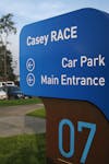
Development of the visual identity system for the complex established a framework for the wayfinding family of signage. Aimed at both vehicles and pedestrians the signage family negotiated a balance of scale to create a legible visual language.
The negative space within the C creates an arrow which communicates the concept of direction and movement. This sense of movement is also supported through the use of a brightly coloured gradient – helping to suggest a sporting context.
Development of the visual identity system for the complex established a framework for the wayfinding family of signage. Aimed at both vehicles and pedestrians the signage family negotiated a balance of scale to create a legible visual language.


- TEAM ASPECT Studios, Iguana Creative, Studio Binocular
- PHOTOGRAPHY